|
Some
basic IDA graphing
IDA? Initial Data Analysis (IDA) should be
performed on every data set you access or collect. The rationale for
IDA is to determine if your data represent what it should represent and
to determine if there are errors in the data.
There are three graphical representations we
typically use. Frequency Tables for all variables which display the
frequency and percentages for each value. Bar graphs for categorical
variables, which allows us to quickly see the distribution of cases in
each category. And, Histograms for continuous or nearly continuous
variables; which allow us to observe the distribution of scores on a
continuous variable.
There are generally speaking two methods of
displaying data outside text when preparing a manuscript or research
report. Tables, which are text based and therefore can be set to
typeface; and Figures which are graphical displays (e.g. histograms,
pie-charts, topographical maps, wiring schematics, etc.). Both forms of
display can be used during IDA to discover data entry errors, describe
the sample characteristics, and determine if your data fits the
assumptions of a particular analysis.
Data Entry Errors. When conducting IDA, you can
evaluate the data looking at the frequency tables for missing data
and/or values that do not correspond to the values expected for a
variable. For example; if you have Gender/Sex coded as 1 = female and 2
= male; but, you notice in the frequency table that case #5 shows a
value of 12; that would be inconsistent with the coding strategy and
known genders/sex for most species.
Describing the Sample. When writing a research
report or simply assessing the external validity of your study, you
must evaluate the sample (i.e. individual characteristics). First, you
may be concerned with the external validity of the sample (how
representative it may or may not be of the population you are
studying). Second, you will likely want to communicate a description of
your sample when writing up the study (to allow others to replicate
your findings). As an example, consider that if only 10% of our sample
was male, your results are only really applicable to females. Using the
frequencies function in SPSS, you can easily produce graphical
representations for a given variable or multiple variables.
Example of Simple Graphing with the
Frequencies function as would be done during IDA.
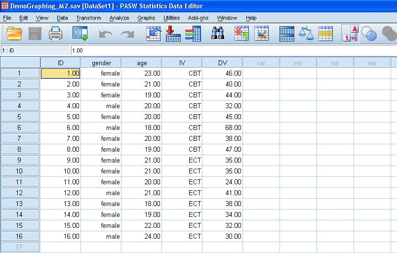
The mock study we will
use today concerns the effectiveness of two types of therapy for
depression on increasing Life Satisfaction Rating. The independent
variable was Type of Therapy, with two conditions;
either Cognitive Behavioral Therapy (CBT) or Electro-Convulsive Therapy
(ECT). The dependent variable was Life Satisfaction Rating
(a series of 10 questions that were totaled to yield a score between 10
and 50 for each of the 16 participants).
The Example Data can be
found
here.
Getting the Frequencies
and Tables/Figures:
- Click on Analyze, then
Descriptive Statistics, then Frequencies. First, you are going to do
the categorical data, so highlight/select “Gender/Sex” and “Type of
Therapy”, and put them in the variables box. (Make sure “Display
Frequency Tables” is checked). Then, click on Charts, and select Bar
Charts (because these are categorical variables). Now click continue
and then click Ok. You should get output similar to that displayed
below.
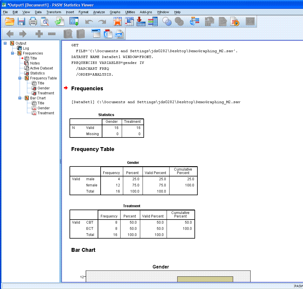
Now
flip back to Data View.
- Click on Analyze, then
Descriptive Statistics, then Frequencies. Second, you’re going to do
the continuous data, so click on the Reset
button <at the bottom>.
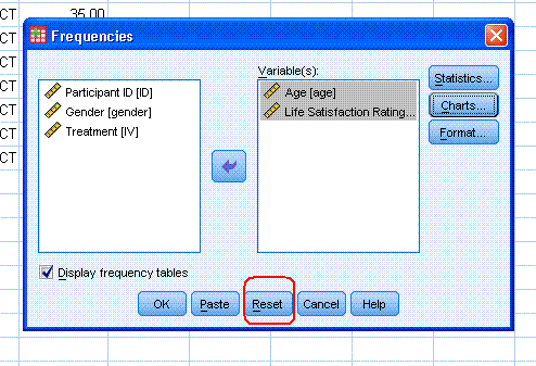
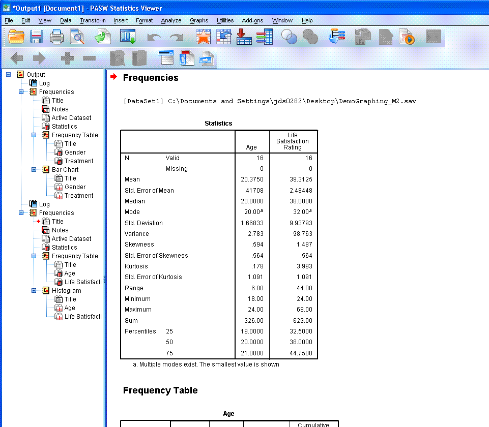
Now, select “Age” and “Life Satisfaction Rating”
and put them in the variables box. Then click on Statistics and select
what you think would be necessary, click continue; then click on Charts
and select Histograms and check the box for “with normal curve”. Now
click continue and then ok. You should see output similar to that
provided below.
Some
interpretation questions:
1. What can we say about
the gender of our sample in terms of external validity? Hint; look at
the bar chart for Gender.
2. Could it be that we
have a data entry error or invalid score for one of our participants on
the Life Satisfaction Rating? Hint: re-read the description of our
dependent variable, Life Satisfaction Rating, and
look closely at the histogram of that variable.
|