|
Initial Data Analysis (IDA) continued from
previous Module. What are descriptive statistics? Descriptive
statistics allow us to describe a set of scores or
multiple sets of scores. There are typically four categories of
descriptive statistics; central tendency, dispersion, distribution, and
relation.
Central Tendency: There are three general measures
of central tendency. (1). Mean. The mean is the most frequently used to
describe the center of a distribution of scores. It is the arithmetic
average of a series of scores. Mean is very sensitive to outliers and
for this reason, it is often preferable to use the trimmed mean which trims
some percentage of extreme scores (e.g. 20%).
(2). Median. The median is the point that delineates two halves of a
series of scores. (3). Mode. The mode is the most frequently occurring
score in a series.
Dispersion: There are 5 general measures of
dispersion. (1). Variance. Variance is the sum of the squared
deviations from the mean divided by the degrees of freedom. In lay
terms, variance is the average deviation of the scores around the mean.
(2). Standard Deviation. Standard deviation is the square-root of the
variance. It is a standardized measure of dispersion (most frequently
used) which allows us to compare distributions of different variables.
Notice that sums of squares is crucial to both. (3). Z-scores (also
called Standard Scores). Z-scores represent a transformation applied to
each score which allows us to compare scores from different
distributions. (4). Range. The range is simply the highest score minus
the lowest score and gives an idea of the spread of scores or distance.
(5). Minimum & Maximum. Simply the minimum and maximum scores.
All measures of dispersion provide an idea of distance or spread.
Distribution: There are two measures of
distribution, both offer a description of the shape of a distribution
of scores. Skewness refers to the amount of non-symmetry a distribution
of scores contains. Negative skew is when the tail points to the
smaller values and most scores are located at the higher values.
Positive skew is when the tail points to the larger values and most
scores are located at the smaller values. Zero skew indicates symmetry.
Kurtosis is used to measure the amount of tail magnitude, commonly
referred to as
peakedness or flatness of a
distribution. Kurtosis is also referred to as a measure of normality.
It is based on the size of a distribution's tails. A distribution with
a large, positive kurtosis has thin tails and the
distribution looks peaked. This is known as leptokurtic. A distribution
with a large, negative kurtosis has large tails or
thick tails and the distribution looks flat. This is known as
platykurtic (like a plateau).
Relation. There are two measures of relation; both
refer to the amount of shared variance two variables have. Measures of
relation are unique in that they are descriptive, but can also be used
inferentially when assessing magnitude. Covariance is an unstandardized
measure of relation. Correlation is a standardized measure of relation;
meaning it can be used to compare the relationships between multiple
variables.
Getting
descriptive statistics in SPSS.
Open the data file named "Cars.sav" which is
available
here.
Method 1:
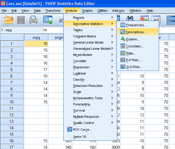
With the Cars data file open in the Data window,
go to Analyze, Descriptive Statistics, and then Descriptives...
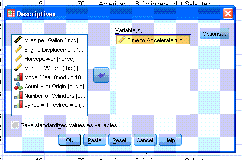
Now you should have a smaller window open,
highlight/select "Time to Accelerate from 0 to 60 (sec) [accel]" and
use the arrow to put it into the variables box.
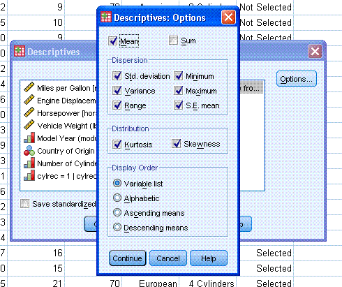
Next, click on "Options..." and select the
descriptive statistics you want (typically mean, standard deviation,
variance, range, standard error (S.E.) of the mean, minimum and
maximum, as well as kurtosis and skewness). Then click "Continue".
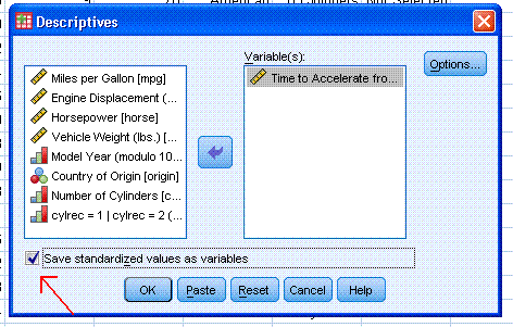
You may also need to get the Z-scores for a
variable and therefore, you can click the box in the lower left corner
"Save standardized values as variables". This function will create a
new variable in your data sheet (in the right-most column of data view)
which will contain the values of each Z-score corresponding to each
individual score for that variable (accel).
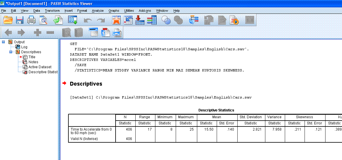
Next, click "OK". The output should contain a
single, very long [to the right] table with all the descriptive
statistics specified (except the Z-scores which are in the data file).
Method 2:
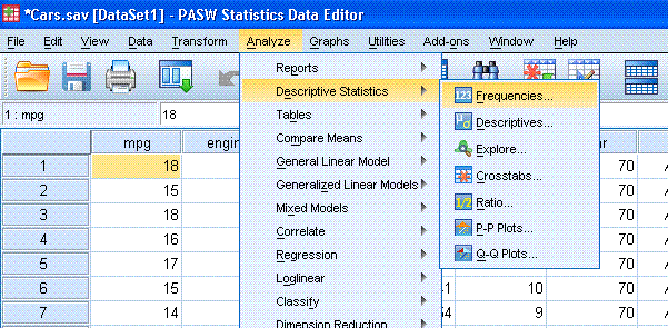
With the Cars data file open in the Data window,
go to Analyze, Descriptive Statistics, and then Frequencies...
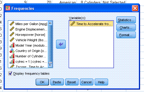
Now you should have a smaller window open,
highlight/select ""Time to Accelerate from 0 to 60 (sec) [accel]" and
use the arrow to put it into the variables box.
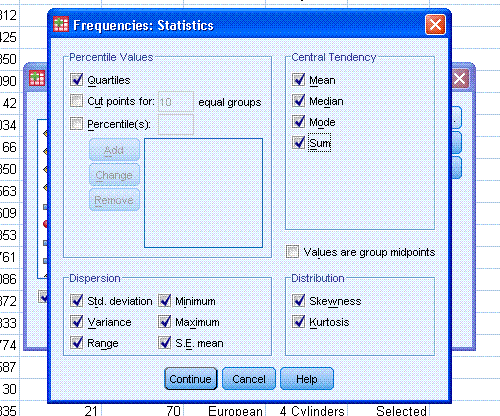
Next, click on "Statistics..." and select all the
statistics specified earlier, as well as quartiles; then click
"Continue".
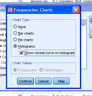
Next, click on "Charts..." and select Histograms
and Show normal curve on histogram. Then click "Continue" and then
click "OK".
You should now see some output similar to that
below. You'll notice the output table containing all the descriptive
statistics is smaller and easier to read than the one provided by the
Descriptive Statistics function above.
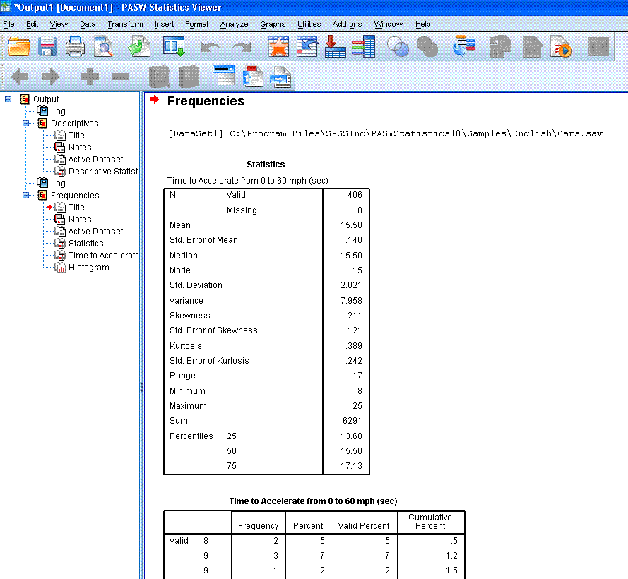
There are four benefits to using the Frequencies
function for gathering descriptive statistics. First, you can get more
descriptive statistics (quartiles), second; you can get a graphical
display of the variable (histogram for continuous variables and bar
graph for categorical variables). Third, you get a frequencies table;
and fourth, the descriptive statistics table is smaller and easier to
read with frequencies function. However, you can only get the
standardized scores (Z-scores) by doing the Descriptives function.
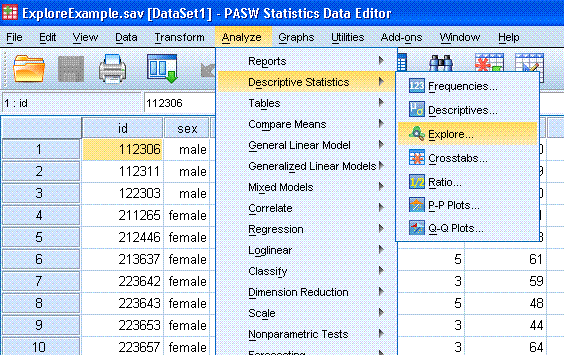
Method 3: The Explore Function for
getting descriptive statistics by group
With the
Explore Example data file open in the Data window, go to
Analyze, Descriptive Statistics, and then Explore...
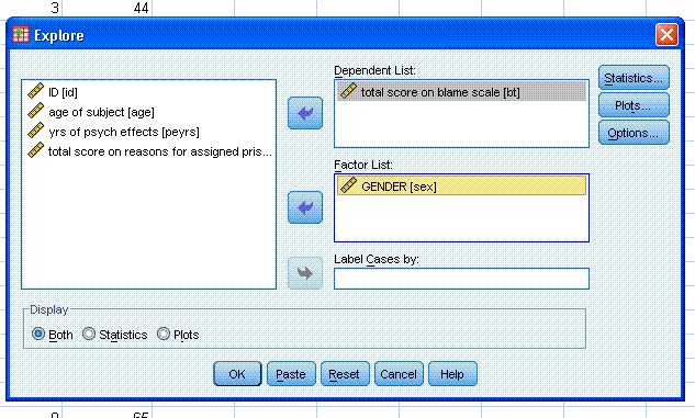
Next, pick your dependent variable, in this
example we'll use the variable "total score on blame scale [bt]".
Highlight and move it to the Dependent List: box. Then, pick your
independent variable, in this example we'll use the grouping variable
"GENDER [sex]". Highlight it and move it to the Factor List: box. Then
click on the Statistics... button.
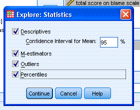
Now we can specify what we want to get. Check
Descriptives, M-estimators, Outliers, and Percentiles. Then click the
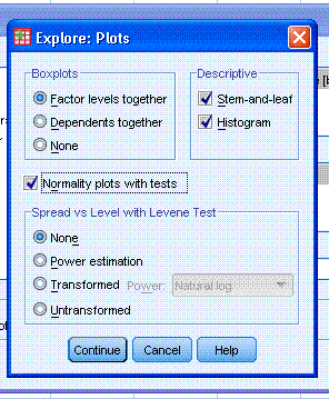
Continue button. Next, click on the Plots button and select Histogram
and Normality plots with tests. Then click the Continue button. Then
click the OK button.
You should see some output similar to that
displayed below.
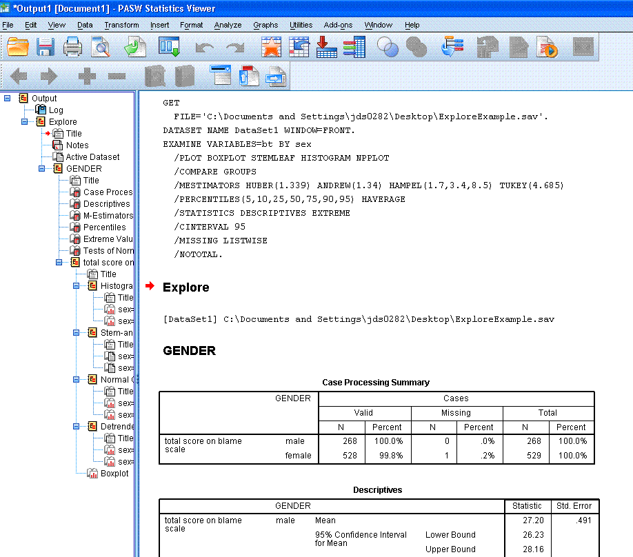
You'll notice you get the Case Processing Summary
which simply reports the number of participants/cases, percentages, and
number of missing for each group of your independent or grouping
variable. Then you get the descriptive statistics for each group,
percentiles, then the table of extreme values. This last one; extreme
values, is very handy for helping to detect and/or evaluate outliers.
Likewise, the Tests of Normality also are helpful for evaluating
assumptions of some common inferential (parametric) analyses. Finally,
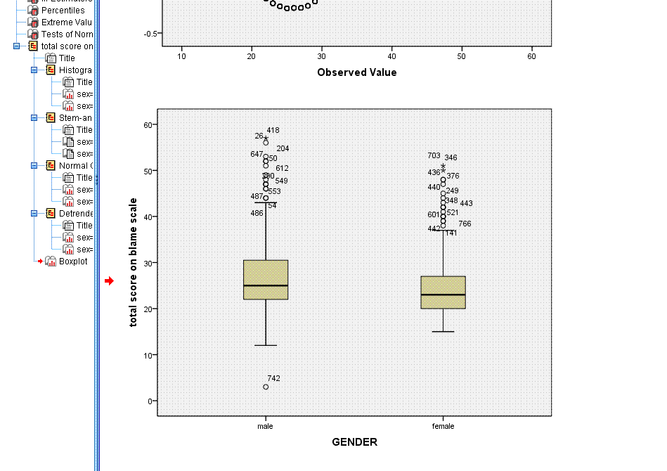
you're given the plots for each group; histogram, stem-and-leaf, and
box plot. The box plot is also very handy for evaluating the normality
and outliers within the groups. Notice within the box plot, extreme
values are marked with the case number and the star symbol, while less
extreme (but likely influential) points are marked with the case number
and the circle symbol.
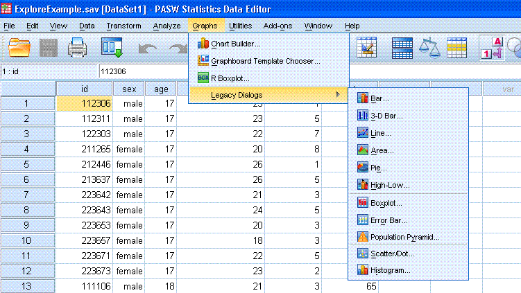
Obviously, SPSS is capable of more complex
graphing. If one is so inclined, one could simply go to Graphs in the
tool bar and practice making different types of graphs with the current
data. Like most functions of SPSS, it is often easy enough to point and
click ones way through a short trial-and-error session to get what one
wants. Recall, the strength of SPSS and what it takes pride in, is its
user-friendliness. SPSS is extremely easy to use and figuring out how
to get what one wants out of it often takes less time than if one used
a tutorial (such as this) to learn.
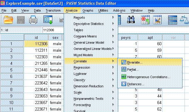
Method 4: Correlation
With the
Explore Example data file open in the Data window, go to
Analyze, Correlate, Bivariate...
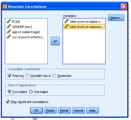
Now you can move 'total score on blame scale' and
'total score on reasons for assigned prison time' to the Variables:
box. Notice, you can get any or all three types of correlation and 2 or
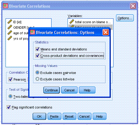
1 tailed significance with or without flagging. Next, click on the
Options... button and specify Means and standard deviations as well as
Cross-product deviations and covariances. Then click the Continue
button, then click the OK button.
You should see output similar to that provided
below. Notice, as is the case with most analysis in SPSS; we specified
and received the descriptive statistics for the variables we analyzed
(mean, standard deviation, number of observations).
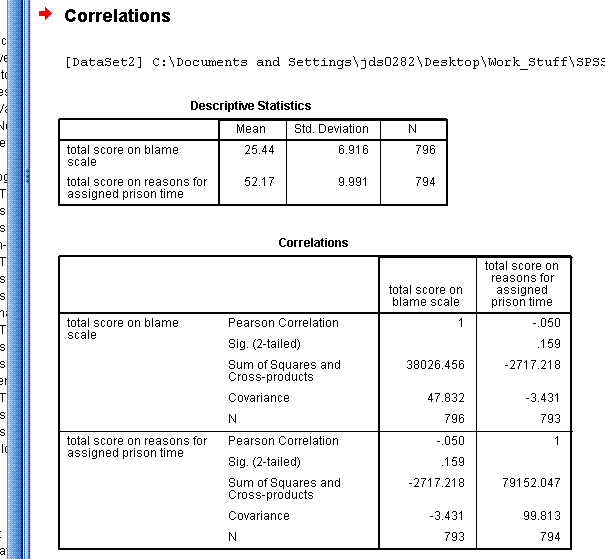
So, we see the correlation between these two
variables is -.050 with a p-value of .159. We could
also say that only about 0.25% of the variance in one variable is
accounted for by the other variable. Correlation squared give the
percentage of variance in one variable which is accounted for by the
other variable; a form of an effect size measure (-.050 * -.050 = .0025
= .25%). Clearly, there is a very weak (and not statistically
significant) relationship between these two variables. The covariance
is -3.431 and there were 793 cases used to compute the
correlation/covariance. Notice only cases with complete data were used.
|