|
Categorical
Principal Components Analysis (CATPCA)
with Optimal Scaling
Categorical principal components analysis (CATPCA)
is appropriate for data reduction when variables are categorical (e.g.
ordinal) and the researcher is concerned with identifying the
underlying components of a set of variables (or items) while maximizing
the amount of variance accounted for in those items (by the principal
components). The primary benefit of using CATPCA rather than
traditional PCA is the lack of assumptions associated with CATPCA.
CATPCA does not assume linear relationships among numeric data nor does
it require assuming multivariate normal data. Furthermore, optimal
scaling is used in SPSS during the CATPCA analysis and allows the
researcher to specify which level of measurement he or she wants to
maintain (e.g. nominal, ordinal, interval/ratio, spline-nominal,
& spline-ordinal) in the optimally scaled variables.
For the duration of this tutorial we will be using
the
Items001.sav
file; which is fictitious and contains 797 participants' responses on
25 items. The first 10 items each have a 7-point Likert response format
and compose one scale. The next 15 items have a 5-point Likert response
format and compose a second scale. Clearly this data lends itself to a
solution with two dimensions or componenets but, typically the solution
would not be so apparent.
CATPCA should be approached in a similar manner as
one would approach a traditional PCA. Both are data reduction
techniques and often require multiple runs of the analysis with
different numbers of variables (referred to as items from this point
forward) and different numbers of dimensions retained in order to
arrive at a meaningful solution.
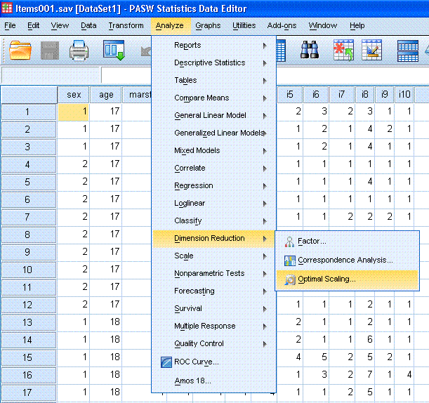
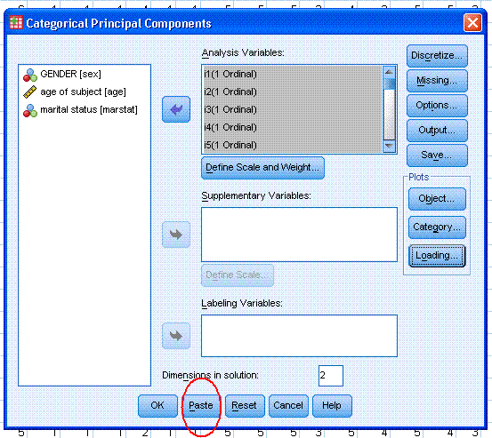
1.) The first example will
include all 25 items. Begin by clicking on Analyze, Dimension
Reduction, Optimal Scaling...
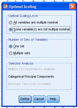
Next, click the circle next to "Some variable(s)
are not multiple nominal" and then click the Define button.
One of things you may want to explore here is the
Missing... button; which does multiple imputation of the mode for
nominal and ordinal variables by default during the analysis.
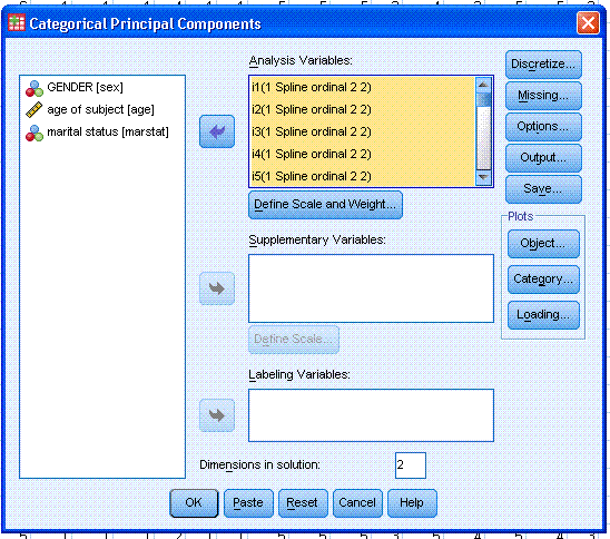
Next, highlight / select all the items and use the
top arrow to move them to the Analysis Variables: box. Then, click on
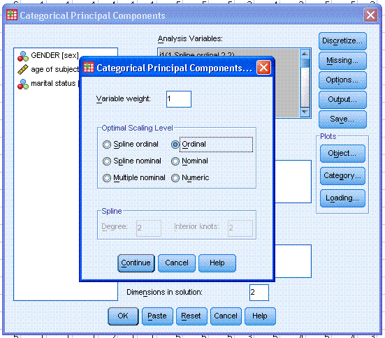
the "Define Scale and Weight..." button. Select the Ordinal for all
items then click the Continue button.
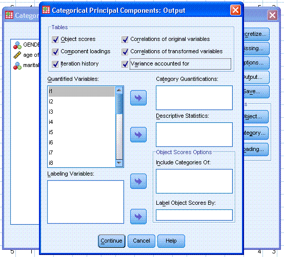
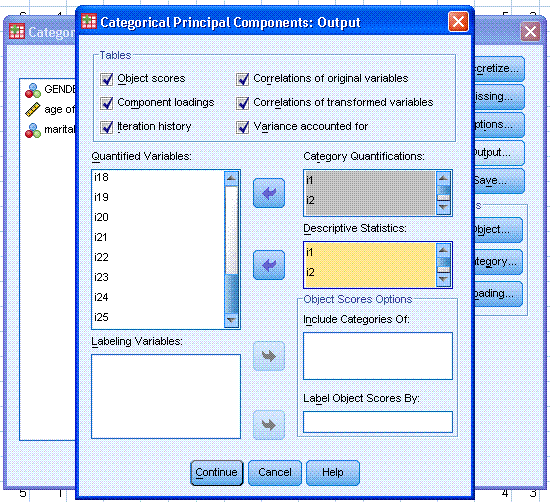
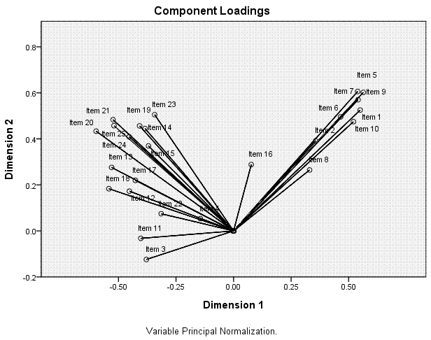
Next, click on the Output button. By default
Object scores and Component loadings should be selected. Select the
other four choices; Iteration history, Correlations of original
variables, Correlations of transformed variables, and Variance
accounted for. Then, highlight / select all the items and use the top
arrow to move them to the Category Quantifications box. Then, highlight
/ select all the items again (in the Quantified Variables: box) and use
the second arrow to move them to the Descriptive Statistics: box. Then,
click the Continue button.
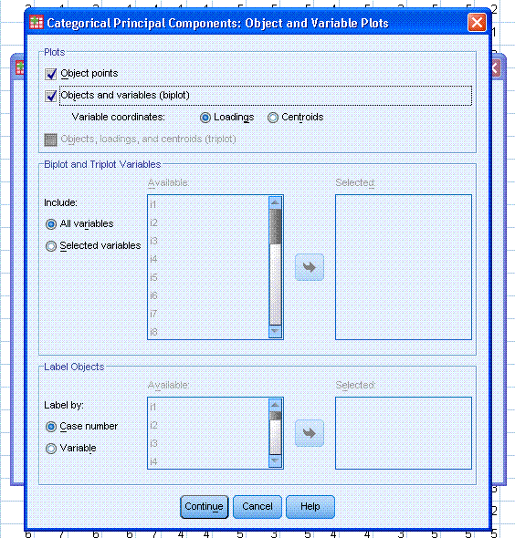
Next, under Plots, click on the Object... button.
By default, Object points should be selected; go ahead and also select
Objects and variables (biplot) with Loadings specified as the Variable
coordinates. Then, click the Continue button.
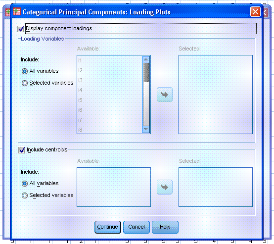
Next, under Plots, click on the Loading... button.
By default, Display component loadings should be selected; go ahead and
also select Include centroids, then click the Continue button.
Next, notice the Dimensions in solution: is listed
as 2; but could be changed. Our example here clearly contains two
dimensions but, if you did not know the number of dimensions, you could
specify as many as there are items in the analysis. Remember, we
generally approach CATPCA in a similar fashion as we would a
traditional exploratory PCA.
Finally, you should click the Paste button; highlighted by
the red ellipse in the picture below. The reason we paste instead of
simply clicking the OK button is because, a bug (or fault) has been
noticed periodically with the CATPCA function. This will be discussed
in greater detail below; but it involves a missing space that should be
present in the syntax and its absence causes SPSS to leave absent a
desirable (and specified) table from the output under certain
conditions.
Next, review the newly created syntax, in the
newly opened syntax editor window. First, you'll likely notice there is
a substantial amount of syntax associated with this analysis; most of
which is attributed to the number of items. Also notice that because we
specified several optional tables, we have a particularly long "/PRINT" statement. Attention
should be paid to this line or lines. The fault mentioned above occurs
within the "/PRINT"
statement. See if you can find the fault (which is present in the
picture below)....
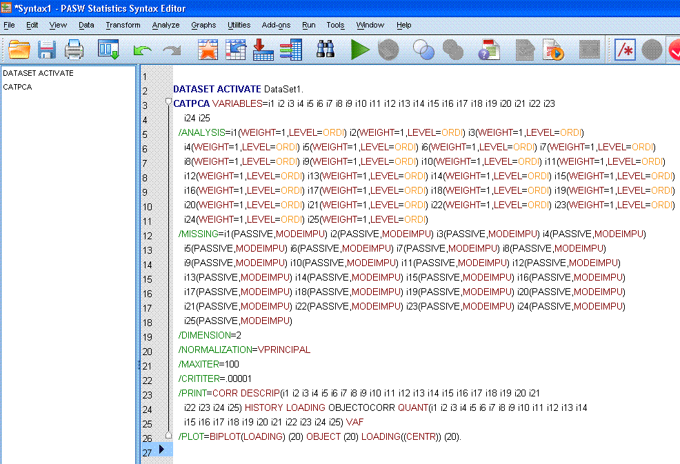
Most of you will likely notice that "OBJECTOCORR"
makes no sense and is one of only a handful of things listed in black
font. Here is where the notorious missing space should be; between
"OBJECT" and "OCORR" (which indicates the Original variable Correlation
matrix). To correct the fault, simply type a space between "OBJECT" and
"OCORR" as can be seen below. Regardless of options specified in the
point-and-click menus; you should always review the syntax associated
with a CATPCA because other missing space errors can occur in the
/PRINT statement.
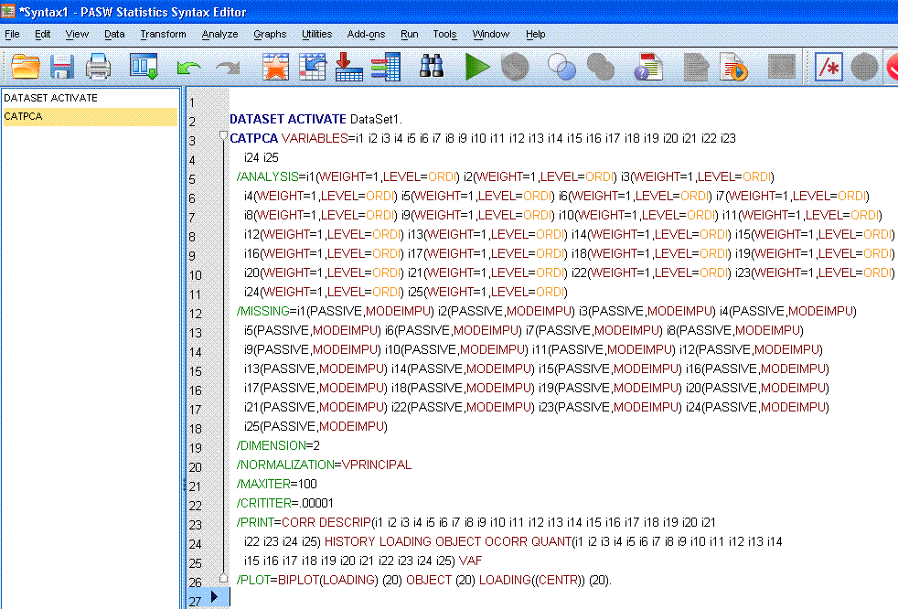
Notice in the /PRINT
statement when the missing space is inserted, the 'smart editor'
recognizes the correct commands for "OBJECT"
and "OCORR" by listing
them in red.
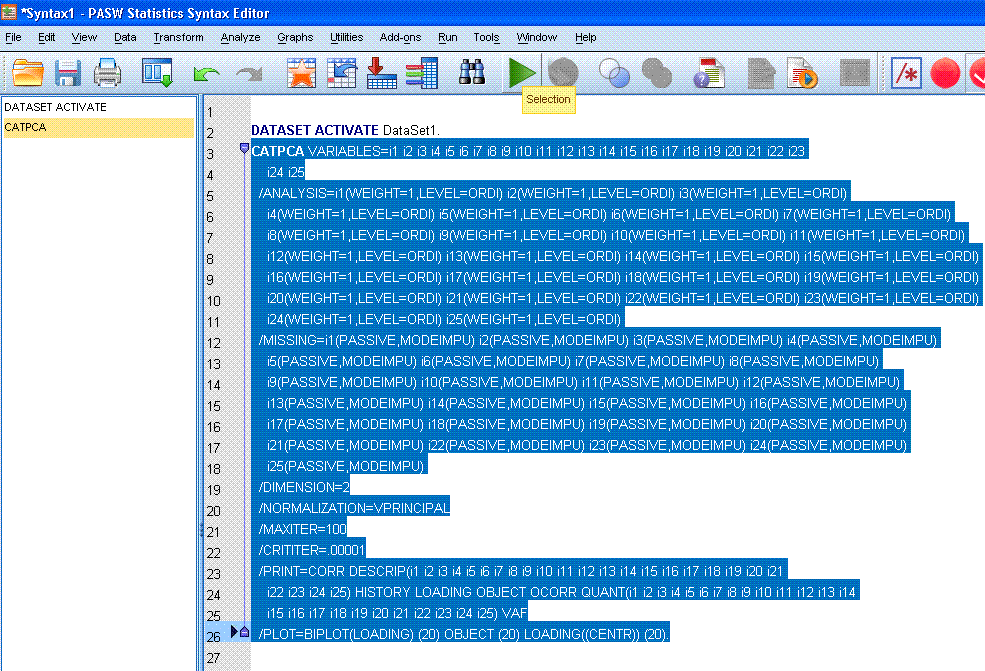
Next, we can highlight / select the entire syntax
and then click the run selection  button to
complete the analysis. button to
complete the analysis.
The (rather substantial) output should be similar
to what is presented below. A text description of each output element
appears below each picture.
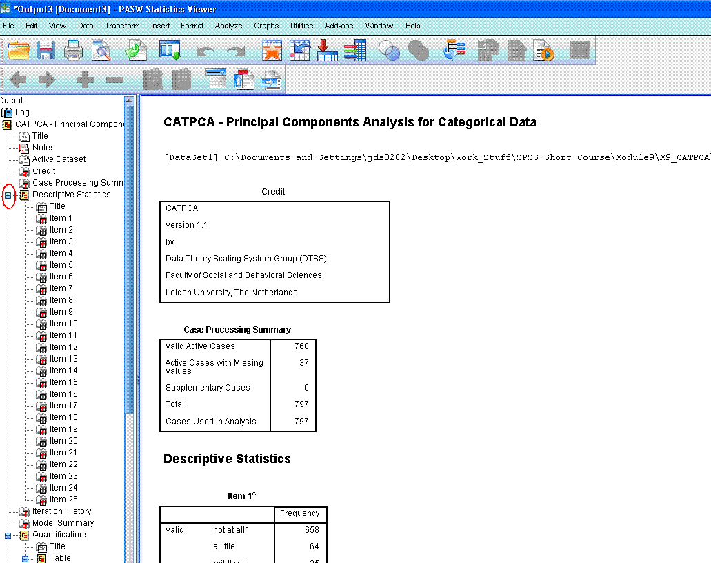
The top of the output begins with a log of the
syntax used to produce the output. Then, there are the Title, Notes
(hidden by default), Credit (citation), and then the Case Processing
summary -- which displays the number of cases and number of cases with
missing values.
Then, there are the Descriptive Statistics tables
associated with each item (variable) included in the analysis. Each of
these frequency tables displays the number of cases for each response
choice in the original variables. Reviewing these tables allows one to
see how cases are distributed among the response choices of each
variable. After reviewing them; it is recommended you use the
minus sign (-)
in the left panel of the output window to hide those tables by
collapsing the output. The minus sign is marked by a red ellipse in the figure
above. Collapsing the output by hiding these tables can allow us to
navigate between tables more easily.
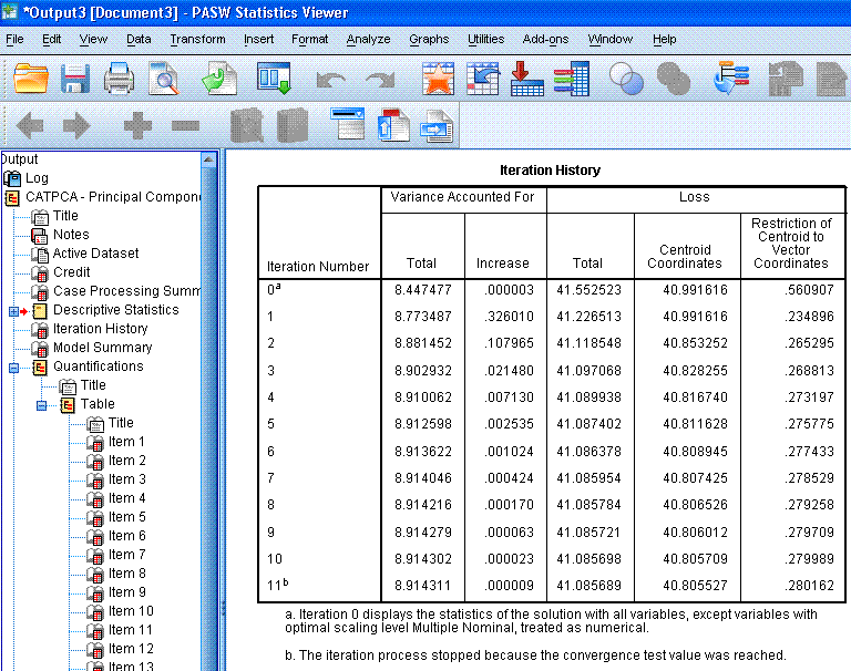
The next table, Iteration History,
displays the eigenvalues for each iteration of the analysis. If, we had
not specified the iteration history in the options, only the zero
iteration and the last (11th) iteration would be displayed. Recall that
in standard PCA, we use the eigenvalues to determine how many principal
components should be retained. Generally, we expect eigenvalues greater
than one to be retained. Here, we see that the standard PCA solution
(iteration 0 -- with all variables/items treated as numeric) results in
an eigenvalue of 8.44 while the CATPCA begins with an eigenvalue of
8.77 and increases with each iteration. Eigenvalues are used to
determine the percentage of variance accounted for (a type of effect
size) and therefore, larger eigenvalues are preferred over smaller
ones. The point here being, because we take into account the ordinal
nature of the items (rather than simply running a traditional PCA), we
get a better solution (higher eigenvalue).
 Next, is
the Model Summary table, which displays the
internal consistency coefficient (Cronbach's Alpha) for each dimension
we specified (2 dimensions) and the combination of both dimensions
(Total). NOW; according to page 143 of the
Categories
user manual (for SPSS version 18; which was used here), there should be
a third column in this table which should include the percentage of
variance accounted for by each dimension and both dimensions (total).
However, using the eigenvalues, we can calculate the percentage of
variance accounted for, for each dimension and for both dimensions. To
calculate the variance accounted for, simply divide the eigenvalue by
the number of items included in the analysis. For instance, the first
dimension accounts for 19.988 % of the variance in the optimally scaled
matrix of 25 items. Next, is
the Model Summary table, which displays the
internal consistency coefficient (Cronbach's Alpha) for each dimension
we specified (2 dimensions) and the combination of both dimensions
(Total). NOW; according to page 143 of the
Categories
user manual (for SPSS version 18; which was used here), there should be
a third column in this table which should include the percentage of
variance accounted for by each dimension and both dimensions (total).
However, using the eigenvalues, we can calculate the percentage of
variance accounted for, for each dimension and for both dimensions. To
calculate the variance accounted for, simply divide the eigenvalue by
the number of items included in the analysis. For instance, the first
dimension accounts for 19.988 % of the variance in the optimally scaled
matrix of 25 items.
Dimension
1:
4.997 / 25 = .19988 = 19.988 %
Dimension
2:
3.917 / 25 = .15668 = 15.668 %
Total:
8.914 / 25 = .35656 = 35.656 %
So, our total model (both dimensions) accounts for
35.656 % of the variance in the optimally scaled items. Notice, the
total eigenvalue is also displayed in the iteration history table
(above).
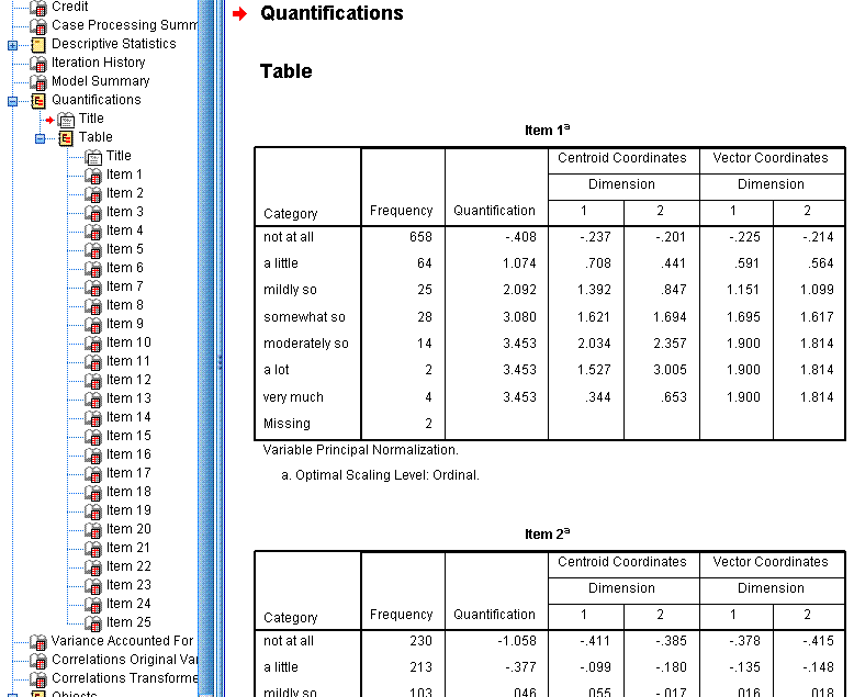
The Quantifications tables display the frequency ,
the quantification value assigned, the centroid coordinates, and the
vector coordinates of each response category for each item. The
centroid coordinates are the average of all cases' object scores for a
particular category on each dimension. The vector coordinates refer to
the coordinates for each response category when the categories are
represented by a straight line between dimensions 1 (x-axis) and
dimension 2 (y-axis) in a scatter plot. We could have generated these
scatter plots in the output; but their usefulness is not terribly
great. Instead; the items (rather than each item's categorical
responses) are the focus. So, like the descriptive statistics tables,
we can hide the quantification tables using the minus sign (-) in the
left panel of the output window.
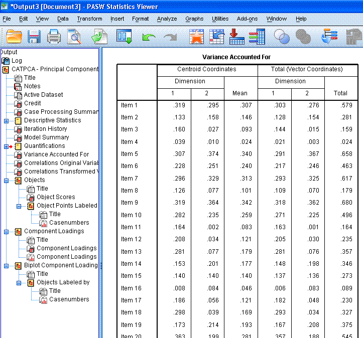
The next table is the Variance Accounted for
table; which is not intuitively named, as it does not display the
variance accounted for. It does however, display the coordinates for
each item on each dimension in relation to the centroid (0, 0) and when
all the items are represented by a straight line between dimension 1
(x-axis) and dimension 2 (y-axis). One thing to look for here is items
that display a very small mean coordinate; which indicates these items
are not contributing substantially to the principal components. Notice,
items 3, 4, 8, 11, 16, and 22 are all very close to or below 0.100.
These items may not be suitably contributing to the principal
components.
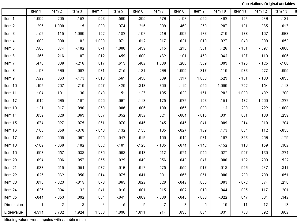
The Correlations Original Variables table displays
those correlations; after missing values have been imputed with the
mode of the variables on which they were missing.
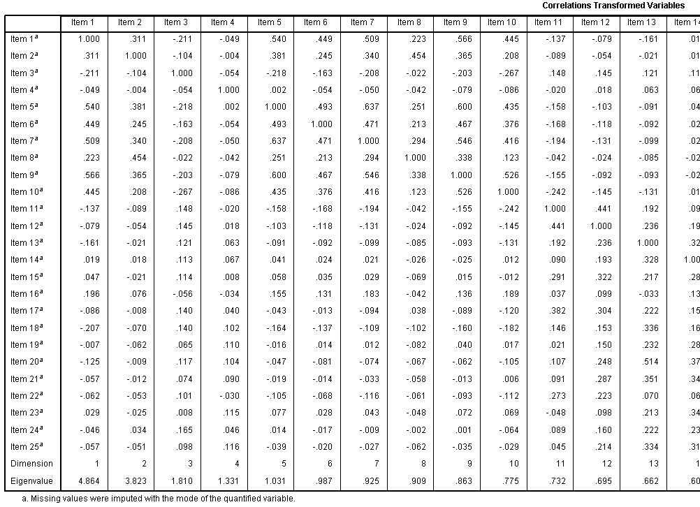
The Correlations Transformed Variables table
displays those correlations. Recall, this is the correlation matrix
after optimal scaling has taken place and this is the matrix used for
the PCA. Notice too, the eigenvalues for each dimension are displayed.
We specified only 2 dimensions / principal components; but you can see
here what the eigenvalues are for each subsequent dimension /
component.
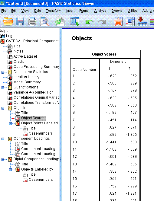
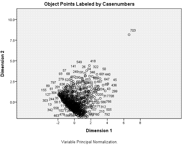
The next table displays the Object Scores for each
case, although; PASW / SPSS abbreviates tables to 100 rows by default.
You could double click on the table to enter the chart editor and
increase the number of rows displayed. These object scores are really
the coordinates associated with each case on each of the two
dimensions; which are plotted in the next element of the output, the
scatter plot shown above-right. We can see here that most cases are
located near the centroid (0, 0) with the majority of cases located
between -2 and 2 on dimension 1 and between -2 and 2 on dimension 2. We
can also see clearly one extreme outlying case (case 703).
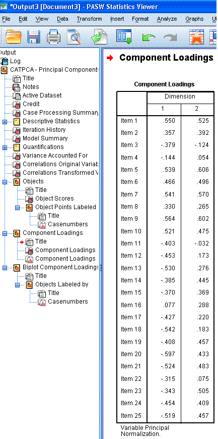
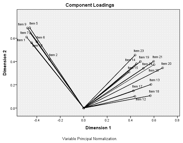
The next table, Component Loadings, shows the
coordinates for each item on each dimension; which are plotted in the
next element of the output, the scatter plot displayed above-right.
Here, we can see how the items related to one another and to the two
dimensions. We can see that the first ten items tend to coalesce
together in the upper range of both dimension 1 and dimension 2; where
as the other 15 items tend to coalesce at the lower range of dimension
1 and they tend to vary substantially along dimension 2. Recall from
above, items 3, 4, 8, 11, 16, and 22 were suspect, based on their
average centroid coordinates and total vector coordinates from the
ineptly named Variance Accounted For table. Here, we see that those
items are closest to the centroid and noticably distant from what we
can see are the two principal components (the cluster of items 1 - 10
and the cluster of items 11 - 15).
Incidentally, for those unfamiliar with
eigenvectors and eigenvalues; one can say that the lines going from the
centroid to each item are 'eigenvectors' and the item is at the
'eigenvalue' for its vector. So, an eigenvalue can be thought of as a
distance point along an eigenvector. In traditional PCA, we often use a
rotation strategy to ease interpretation. So, imagine rotating both
dimensions 45 degrees counter-clockwise (or anti-clockwise). Then, each
dimension axis would essentially be going through a cloud of points /
items.
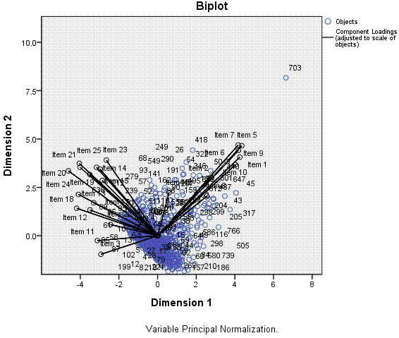
Finally, we get a scatter plot with each item
(black) and each case (blue) plotted along dimension 1 and dimension 2.
Here, we can see that dimension 1, which is able to capture more of the
variance among the items and cases, can explain the variance better
than dimension 2 -- on which items and cases are more condensed (less
variable/variance) and overlapping of one another.
2.) The second example will
include only the 19 retained items after dropping items 3, 4, 8, 11,
16, and 22..
Now, rather than go back through each step and
each element of the output; we have below selected output from a second
CATPCA in which we removed items 3, 4, 8, 11, 16, and 22. It is
important to note that with an iterative analysis, results may vary
slightly.
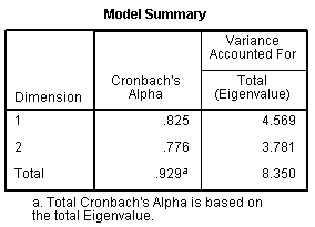
We can see in the Model Summary table our internal
consistency coefficient increased from 0.925 with all 25 items to 0.929
with only 19 items. If we calculate the variance accounted for, we come
up with 24.047 % of the variance accounted for by dimension 1; 19.900 %
of the variance accounted for by dimension 2; and 43.947 % of the
variance accounted for in our 19 items by the total model (both
dimensions). This compares well with the lower variance accounted for
of 35.656 % total when all 25 items were included. So, we have fewer
items, but we are accounting for more of the variance in those 19 items
than the amount of variance accounted for in 25 items, when 25 items
were included.
Here we see the 'clean' or tight grouping of items
on each of the two principal components. Notice too that without the
six poor items, our items have 'moved' in relation to the dimensions;
essentially switching orientation.
As with most of the tutorials / pages within this
site, this page should not be considered an exhaustive review of the
topic covered and it should not be considered a substitute for a good
textbook.
|