|
Bivariate
Linear Regression
in SPSS.
Regression analysis can have a couple of different
purposes. Generally regression is used as a means to predict values or
scores on the outcome variable using one or more predictor variables.
However, regression is also often used as a means of determining
variable importance, meaning how are two or more variables related in
the context of a model. There are a vast number of types and ways to
conduct regression. This tutorial will focus exclusively on ordinary
least squares (OLS) linear regression. As with many of the tutorials on
this web site, this page should not be considered a replacement for a
good textbook, such as:
Pedhazur, E. J. (1997). Multiple
regression in behavioral research: Explanation and prediction
(3rd ed.). New York: Harcourt Brace.
For the duration of this tutorial, we will be
using
RegData001.sav
Regression Assumptions: Regression
is perhaps the most popular form of statistical analysis.
Unfortunately, regression also likely has the distinction of being the
most frequently abused statistical analysis, meaning it is often used
incorrectly. There are many assumptions of regression analysis. It is
strongly urged that one consult a good textbook (such as Pedhazur,
1997) to review all the assumptions of regression. However, some of the
more frequently violated assumptions will be reviewed here briefly.
First, regression works best under the condition of proper model
specification; essentially, you should have all the important variables
in the model and no un-important variables in the model. Literature
reviews on the theory and variables of interest pay big dividends when
conducting regression. Second, regression works best when there is a
lack of multicollinearity. Multicollinearity is a big fancy word for:
your predictor variables are too strongly related, which degrades
regression's ability to discern which variables are important to the
model. Third, regression is designed to work best with linear
relationships. There are types of regression specifically designed to
deal with non-linear relationships (e.g. exponential, cubic, quadratic,
etc.); but standard multiple regression using ordinary least squares
works best with linear relationships. Fourth, regression is designed to
work with continuous or nearly continuous data. This one causes a great
deal of confusion, because 'nearly continuous' is a subjective
judgment. A 9-point Likert response scale item is NOT a continuous, or
even nearly continuous, variable. Again, there are special types of
regression to deal with different types of data, for example, ordinal
regression for dealing with an ordinal outcome variable, logistic
regression for dealing with a binary dichotomous outcome, multinomial
logistic regression for dealing with a polytomous outcome variable,
etc. Furthermore, if you have one or more categorical predictor
variables, you cannot simply enter them into the model. Categorical
predictors need to be coded using special strategies in order to be
included into a regression model and produce meaningful interpretive
output. The use of dummy coding, effects coding, orthogonal coding, or
criterion coding is appropriate for entering a categorical predictor
variable into a standard regression model. Again, a good textbook will
review each of these strategies--as each one lends itself to a
particular purpose. Fifth, regression works best when outliers are not
present. Outliers can be very influential to correlation and therefore,
regression. Thorough initial data analysis should be used to review the
data, identify outliers (both univariate and multivariate), and take
appropriate action. A single, severe outlier can wreak havoc in a
multiple regression analysis; as an esteemed colleague is fond of
saying...know thy data!
Bivariate Regression. The
simplest form of regression is bivariate regression, in which one
variable is the outcome and one is the predictor. Very little
information can be extracted from this type of analysis. The most
meaningful statistic is likely to be the correlation coefficient
squared (R²), which refers to
the amount of variance in one variable accounted for by the other.
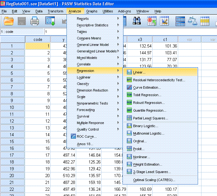
Start by clicking on Analyze, Regression, Linear...
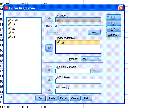
Next, highlight the y variable and use the top
arrow button to move it to the Dependent: box. Then, highlight the x1
variable and use the second arrow button to move it to the
Independent(s): box.
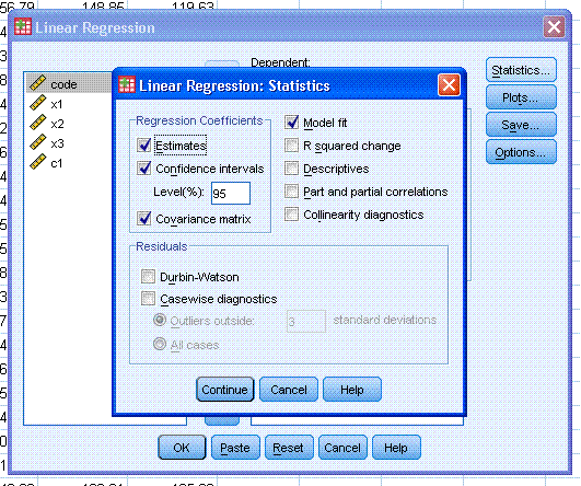
Next, click on the Statistics... button and select
Confidence intervals and Covariance matrix (Estimates & Model
fit should be selected by default). Then, click the Continue button.
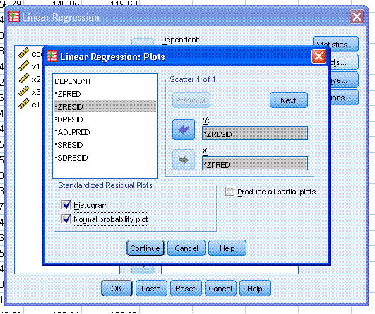
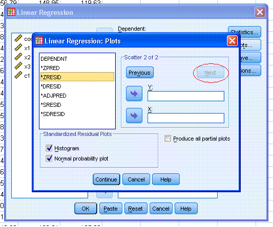
Next, click on the Plots... button. Then,
highlight *ZPRED and use the second arrow button to move it to the X:
box. Then highlight *ZRESID and use the top arrow button to move it to
the Y: box. Then, select Histogram and Normal probability plot. Next,
click the Next button (marked with a
red ellipse
in the figure to the right). Finally, click the Continue button.
Next, click the OK button to complete the
regression analysis and produce output similar to that displayed below.
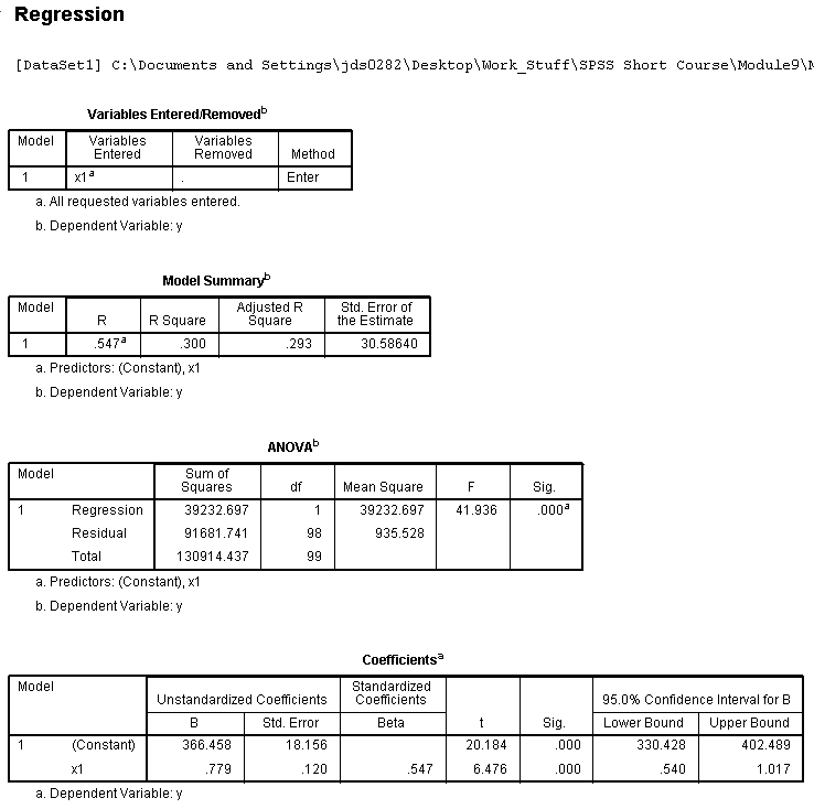
Interpretation of the Model Summary Table shows us
that the multiple correlation coefficient (R; i.e.
the correlation between the predictor and the outcome variables) is
.547, which when squared gives us .300 which can be thought of as the
amount of variance in the outcome variable that is accounted for by the
predictor variable. Generally expressed as: 30% of the variance in y
was accounted for by x1. However, R² tends to be slightly
optimistic and therefore, a more appropriate metric is adjusted
multiple correlation coefficient squared (adj. R² =
.293). Next, we see the ubiquitous ANOVA table which simply tests
whether or not our model is significantly better than just using the
mean of x1 to predict new values of y. Here, our model is significantly
better. Another way of thinking about this ANOVA table concerns whether
or not the R² is significantly different from zero.
Next, we see our Coefficients table which gives the unstandardized and
standardized coefficients (for building a regression equation) as well
as a
t test for each. So, if we wanted to
predict new raw scores on the outcome variable (y), we would use the
following equation:
(1)
y = .779*x1 + 366.485
where
the .779 is the unstandardized coefficient for the predictor (often
called the b-weight) and the 366.485 is the y-intercept term (often
called a). The t test for the constant or
y-intercept has virtually no meaning. The t test for the predictor
coefficient is testing whether or not the coefficient is significantly
different than zero. The standardized coefficient (often called Beta
and given the symbol β) represent the correlation between the predictor
and the outcome. As you can see, in the case of only one predictor, it
is the same as the multiple correlation (R). If we
were interested in predicting new standardized scores of the outcome
(y) then we would use the following regression equation:
(2)
Zy = .547*Zx1
where
the .547 represent the coefficient for the standardized predictor.
There is obviously not an intercept term when dealing with standardized
scores because, the intercept is always zero on both the x and y
axis--commonly called the centroid.
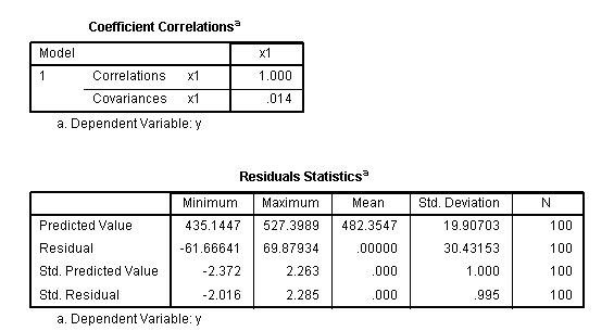
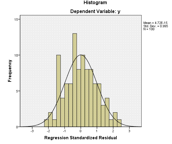
The
next table gives us the correlation and covariance matrix for our
coefficient(s). Then, we have the residual descriptive statistics table
which displays descriptive summary statistics for the residuals, also
called errors of prediction (y - yhat). This table is followed by a
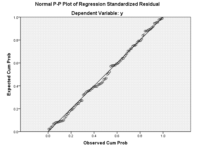
histogram of the residuals, which we expect to be normally distributed
and finally a diagnostic plot showing the expected versus observed
probability values.
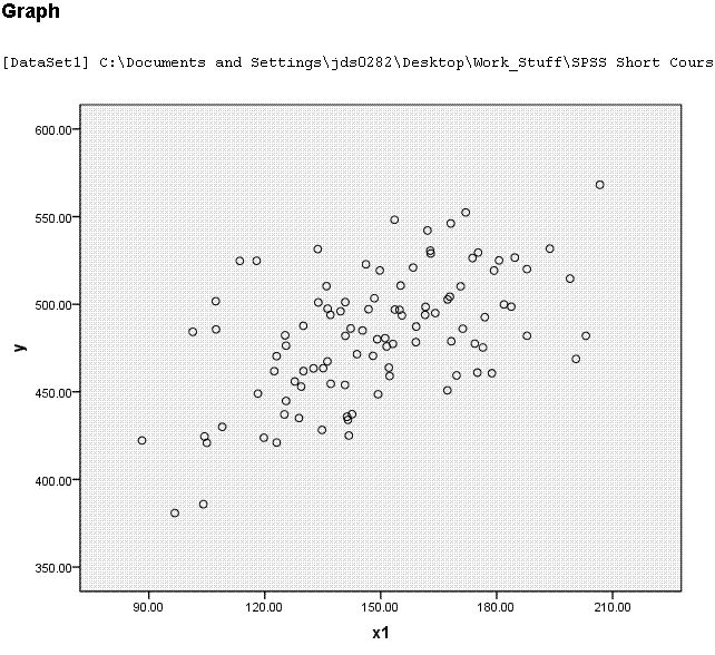
As
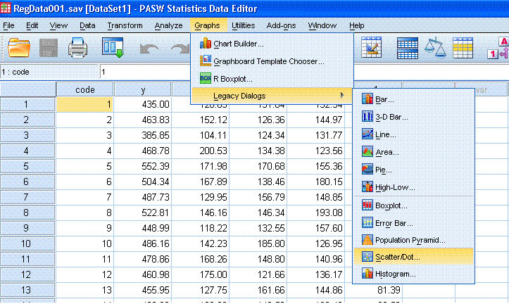
shown in a previous tutorial, we can get an informative scatterplot to
represent our bivariate regression by clicking no Graphs, Legacy
dialogs, Scatter/Dot...
Next,
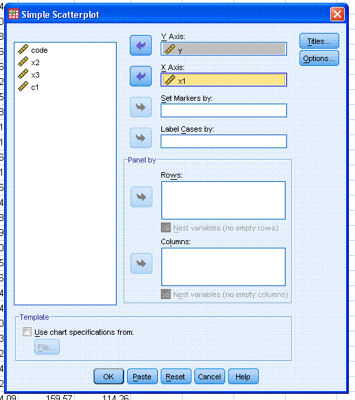
click the Define button (the default Simple Scatter is appropriate).
Then highlight the y variable and use the top arrow button to move it
to the Y Axis: box. Then, highlight the x1 variable and use the second
arrow button to move it to the X Axis: box.
Next,
click the OK button to create the simple scatterplot.
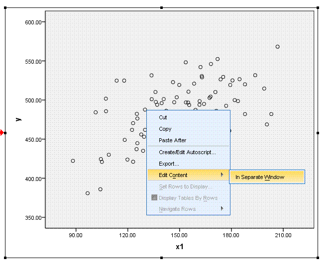
Next,
right click on the scatterplot in the output and select Edit Content,
In Separate Window to bring up the chart editor.
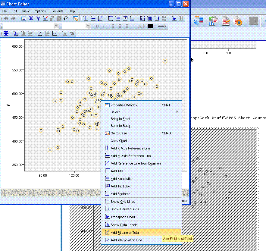
Using
the Chart editor, right click on the actual data points in the scatter
plot (in the chart editor), at which point they should turn a yellow
color. Then, select Add Fit Line at Total.
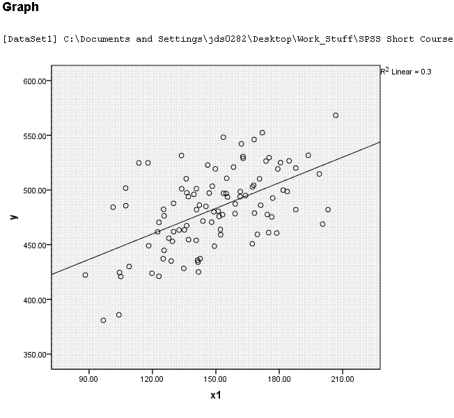
Next,
simply left click somewhere in the white space of the output (outside
the chart editor). You should now see something similar to what is
displayed below. Note, the y-intercept does not seem to match with what
is in the table above because, the scale of the x-axis begins at
approximately 80 rather than zero.
This concludes the bivariate regression section.
The next section focuses on
Multiple
Linear Regression.
|