|
General
Comments concerning inferential statistics in SPSS.
Many analyses are available in the Analyze menu
from simple correlations to multivariate design and more that are
available through syntax.
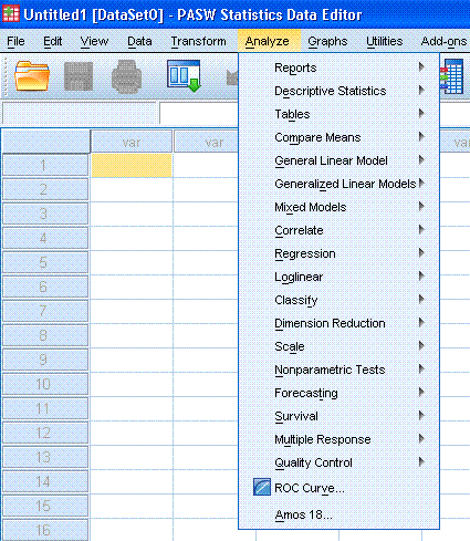
However, one should not let SPSS's options dictate
what analyses are performed. SPSS does not provide much in the
way of statistical analysis post-1975 and so other packages may be
necessary to accomplish one's tasks with more statistical
power. But what SPSS may lack in more modern analysis it makes
up for in performing the most rudimentary forms of analyses available
with relative ease (if you prefer clicking 15 things versus typing one
line of code in some packages; I personally find the latter more
rewarding).
For example, load the Cars data set which is
available with every installation of SPSS in the Samples directory.
Once loaded, one might suspect there is a relationship between the
cars' weights and their mile per gallon gasoline
consumption. To run the linear regression is rather easy,
simply click on Analyze, then Regression, then Linear....
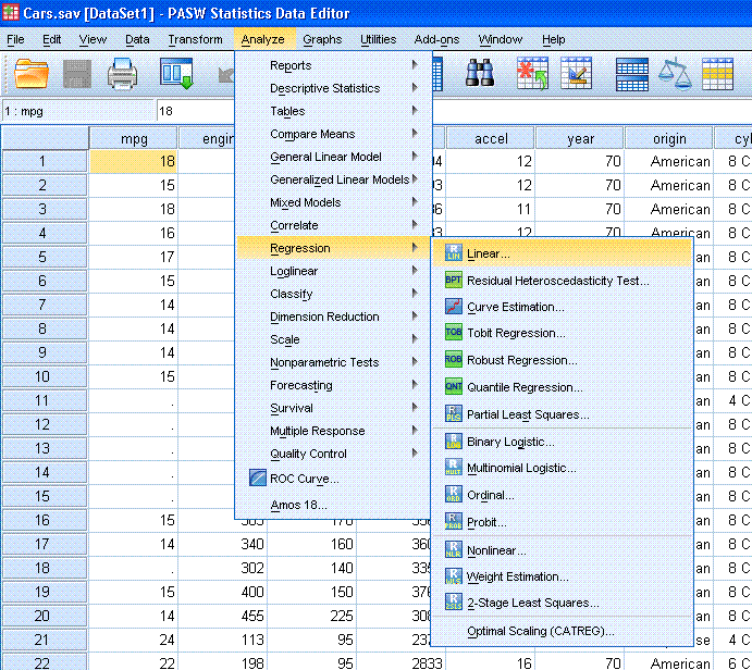
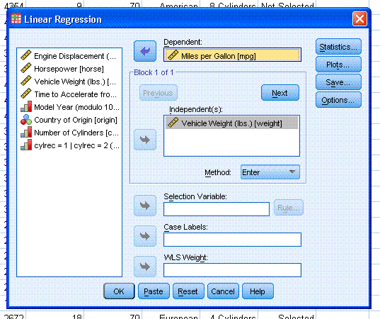
Next, select weight as the independent variable
and mpg as the dependent variable. Then click the OK button.
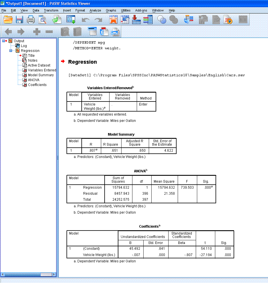
You
should see output similar to what is below.
We would
also like to take a look at the relationship graphically. SPSS
has always been fairly weak with regard to graphical display
relative to other programs, with some of the graphs bordering on
laughable (e.g. the default 3d scatterplots). The Graphs menu
is easy to use until you want to tweak and tailor the graph to your own
liking, in which case you're likely in for a headache (and bugs). One
doesn't have a whole lot of control of the initial output nor can one
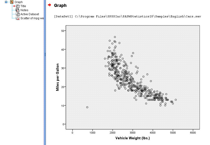
manipulate it very easily. However, an example is given below
of a simple scatterplot from the above examination. A couple
of things stick out. One is that there appears to be a
curvilinear relationship rather than strictly linear one (there are
actually subgroups in this data with linear relationships of varying
degrees), and secondly, one case appears to be an extreme data point
(lower left) that will require some action. In this case, the
data point is a miskey of some kind (4 cu inch engine?) and has missing
data on several of the other variables and so we would not want to
include it in the analysis.
At any rate, here is how to get a standard scatter
plot.
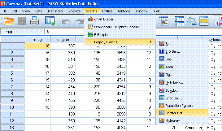
First, go to Graphs in the tool bar, then Legacy
Dialogs, then Scatter/Dot...
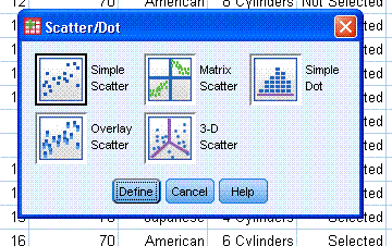
Next, specify Simple Scatter (default). Then move
"Miles per Gallon [mpg]" to the Y Axis box and move "Vehicle Weight
(lbs.) [weight]" to the X Axis box. Then click the OK button.

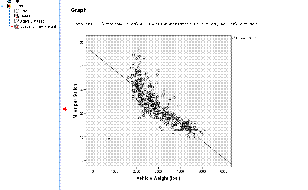
You should now see something similar to what is
below in the output window; which is all well and good -- a basic
scatter plot showing the relationship between two variables.
However, it is often desirable to have an actual
line of best fit superimposed on the data, or you may prefer different
colors or scale values, or tick marks, etc. Just about anything can be
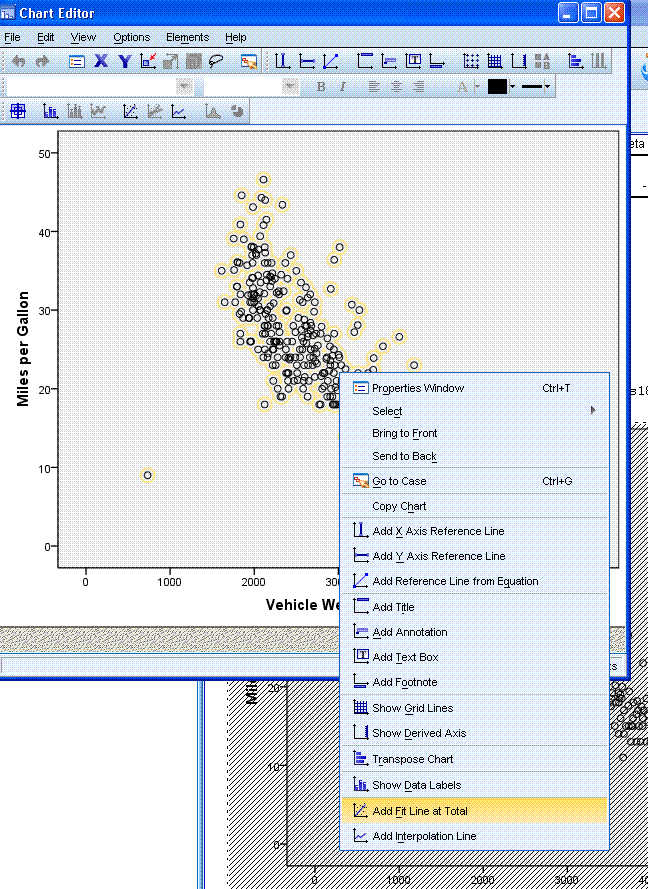
manipulated in a graphical display by right-clicking on the graph and
entering the chart editor (In Separate Window).
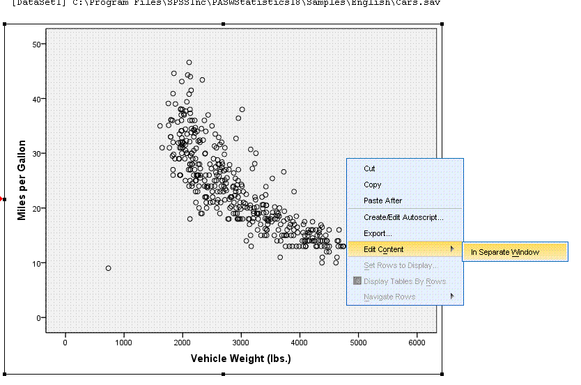

In the chart editor, just about anything in the
graph can be clicked on and altered. For instance, right click on the
data points displayed in the scatter plot (in the chart editor). When
you do, the points should be highlighted in yellow. You can then select
"Add Fit Line at Total".
Once the fit line has been specified, you should
see it in the chart editor. You will also notice, a linear fit line is
not the only type of line which can be specified. Looking at the
Properties box (right) shows different types of fit methods available.

Now, if we simply click (left-click) outside the
chart editor, somewhere in the white-space of the output window; you'll
see the line has been applied to the actual scatter plot.
Other elements of the graph can be changed; color
and type of data points, as well as scale by using the chart editor in
similar fashion as what was done above.
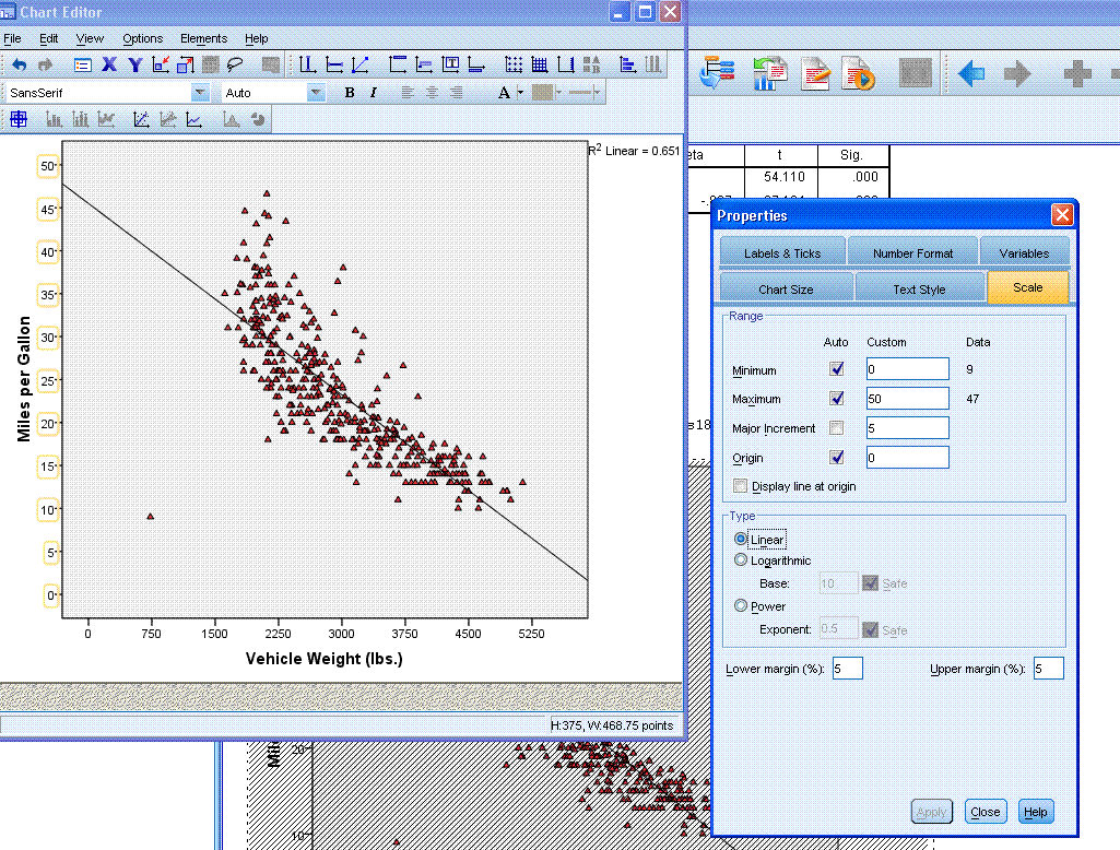
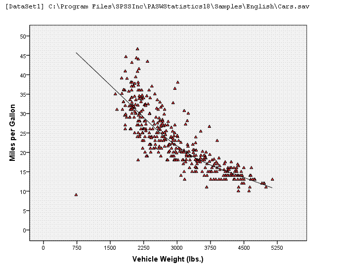
Below, we have the same graph, with changes
applied (including a Loess fit line).
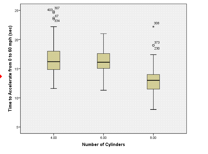
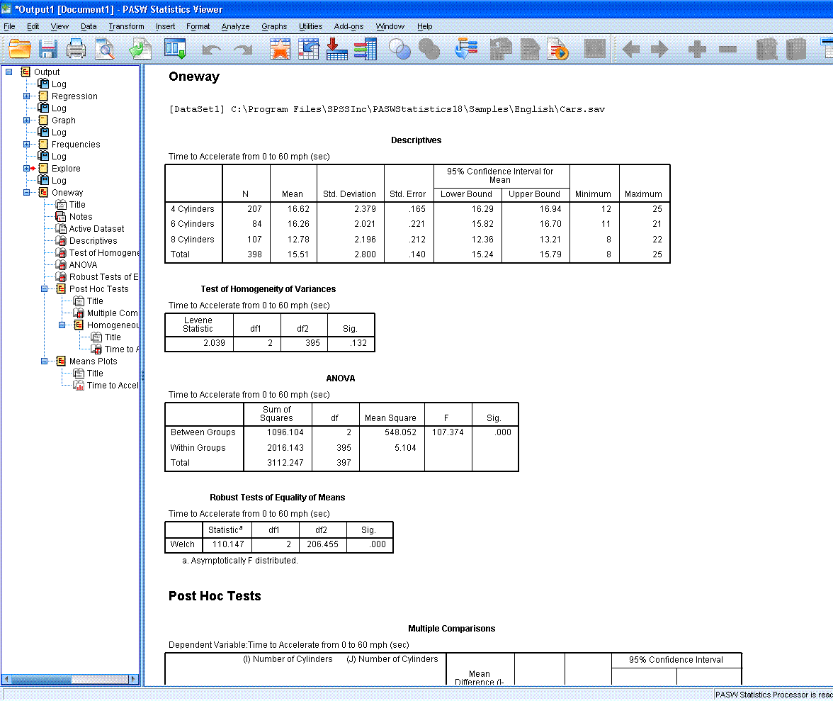
Oneway ANOVA
after using recode function to select only cases with 4, 6, & 8
cylinders. The boxplot below was produced using the Explore function
with the newly recoded filter variable for number of cylinders.
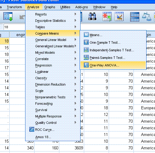
To conduct the oneway ANOVA, simply go to Analyze,
Compare Means, One-Way ANOVA...
Next, specify your Dependent variable(s) and
Factor.

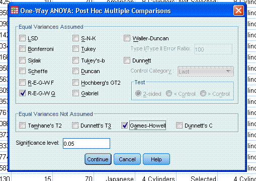
Next, click on the Post Hoc... button to specify
which post hoc test(s) and which equal variances not assumed test(s)
you would like. Then click the Continue button.
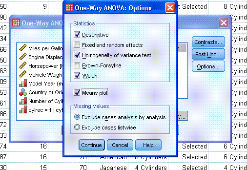
Next, click on Options... and select all desired
options. Then click the Continue button, then click the OK button.
The output should look similar to that displayed
below.
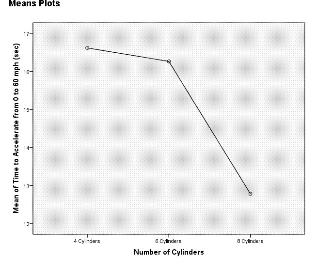
The Means Plot displayed above was specified when
selecting options for the ANOVA. It is displayed here as a comparison
to the boxplot produced above as part of the Explore function. Clearly,
the boxplot is better at conveying the same information.
|